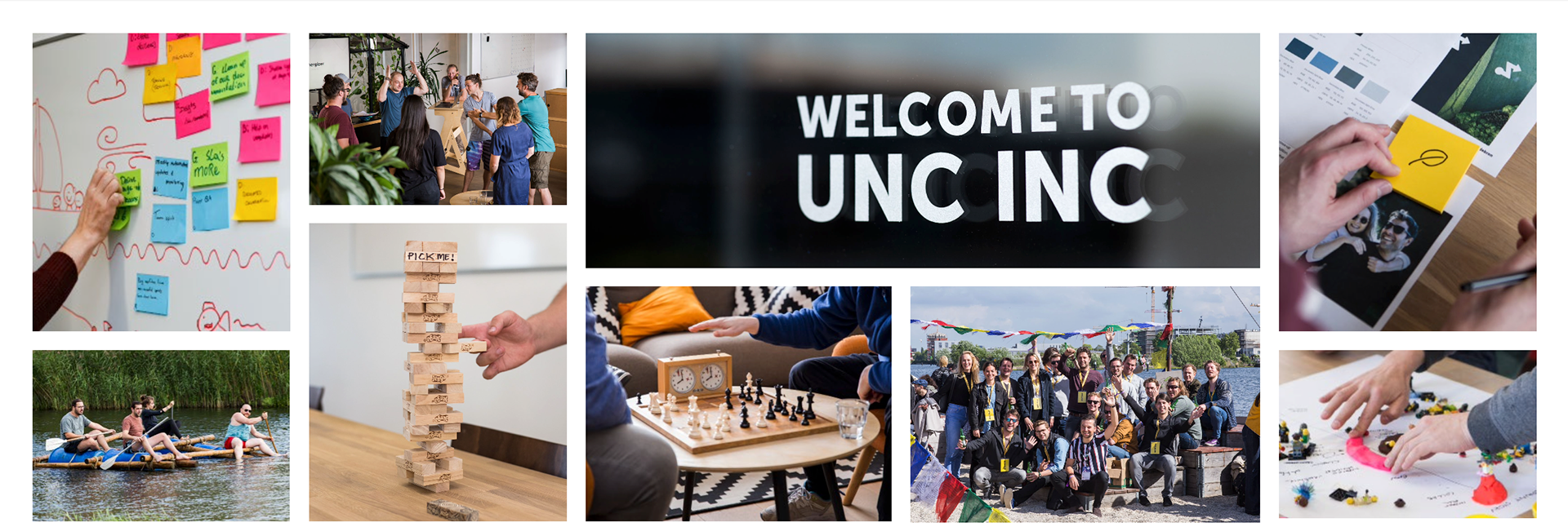
Unc Inc is a digital agency that focuses on developing digital products for mission-driven brands. Collaborating with partners and users, they conceive, design, and build products that connect business objectives with positive impact.
Their portfolio includes platforms, apps, and websites, all crafted to be beautiful, functional, and future-proof. Their best work is dedicated to causes they believe in, all guided by Human-Centered Design principles.
Their portfolio includes platforms, apps, and websites, all crafted to be beautiful, functional, and future-proof. Their best work is dedicated to causes they believe in, all guided by Human-Centered Design principles.
Unc Inc envisions a world where commerce and idealism coexist. Their inception was driven by a desire to blend corporate with uncorporate values.
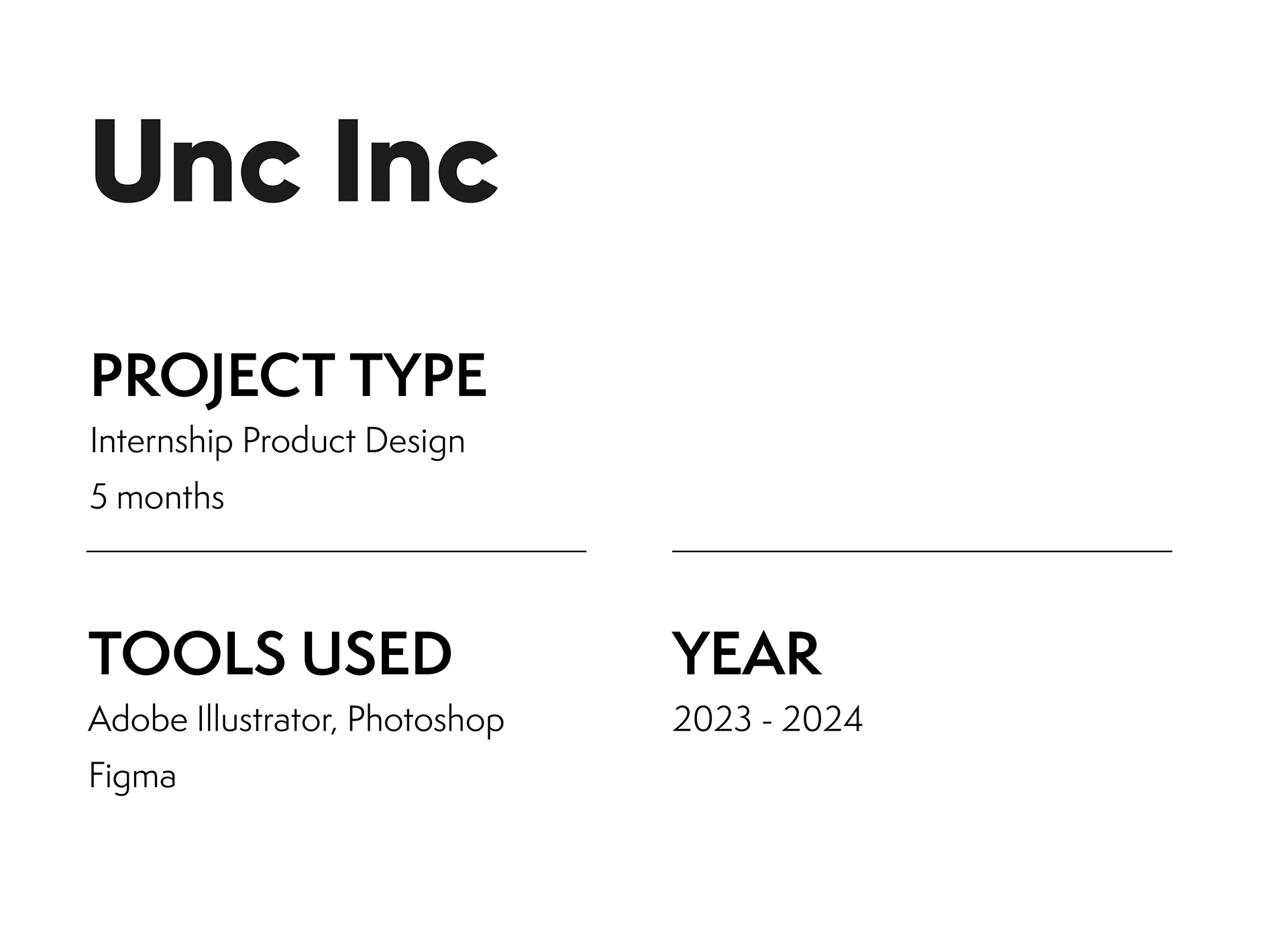
This internship is in collaboration with the Communication and Multimedia Design program at Hogeschool Utrecht.
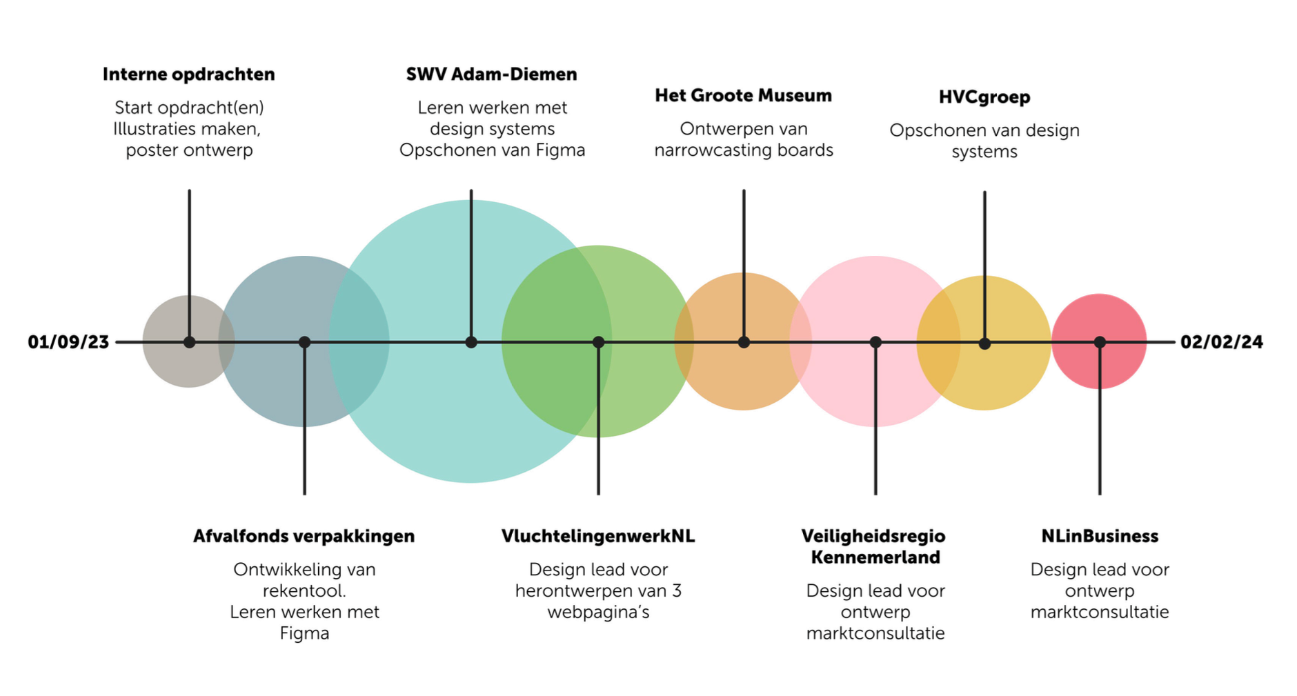
The tasks during this internship include internal work as well as client work for, among others: Afvalfondsverpakkingen, SamenwerkingsVerband Adam-Diemen, VluchtelingenwerkNL, Het Groote Museum, Veiligheidsregio Kennemerland, HVCgroep, and NLinBusiness.
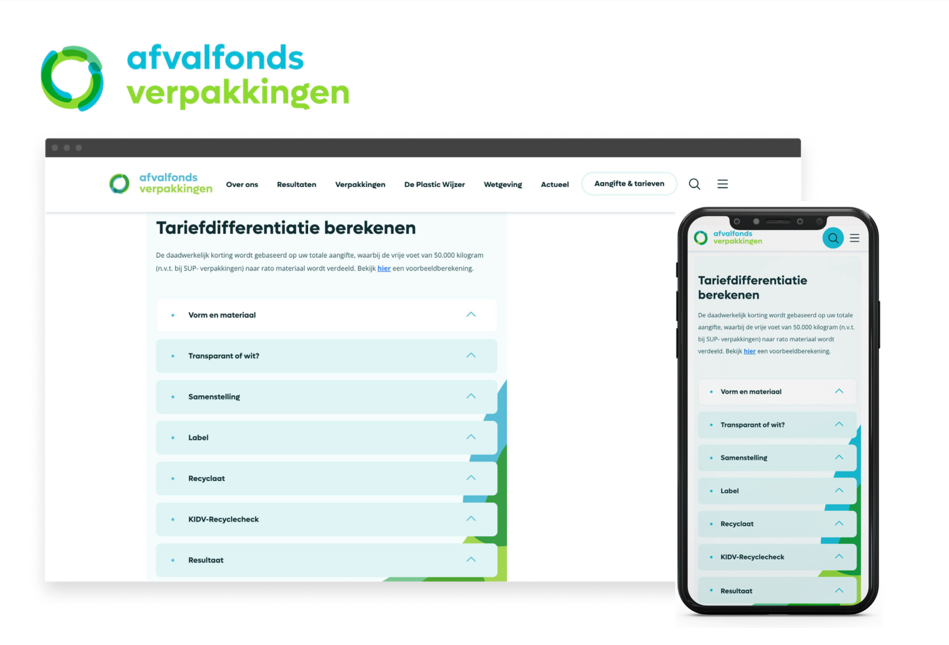
Afvalfonds Verpakkingen (now "Verpact") approached Unc Inc to develop a tool aimed at providing customers insights into how they can further make their current packaging more sustainable and optimize it for recycling. The tool will act as an intuitive 'decision tree', allowing users to make 'yes-no' decisions to immediately understand opportunities for enhancing sustainability and reducing costs on their existing packaging. The initiative focuses on minimizing waste and promoting recyclability, and the tool should be versatile, usable across multiple pages on their current website.
The tool prioritizes user-friendliness, integrating clear visuals and understandable language to make the decision tree accessible to all users. Where technical jargon was unavoidable, references to definitions are provided. The design process involved close collaboration with developers and followed an iterative approach, ensuring alignment between design and development while staying within the established budgetary constraints.
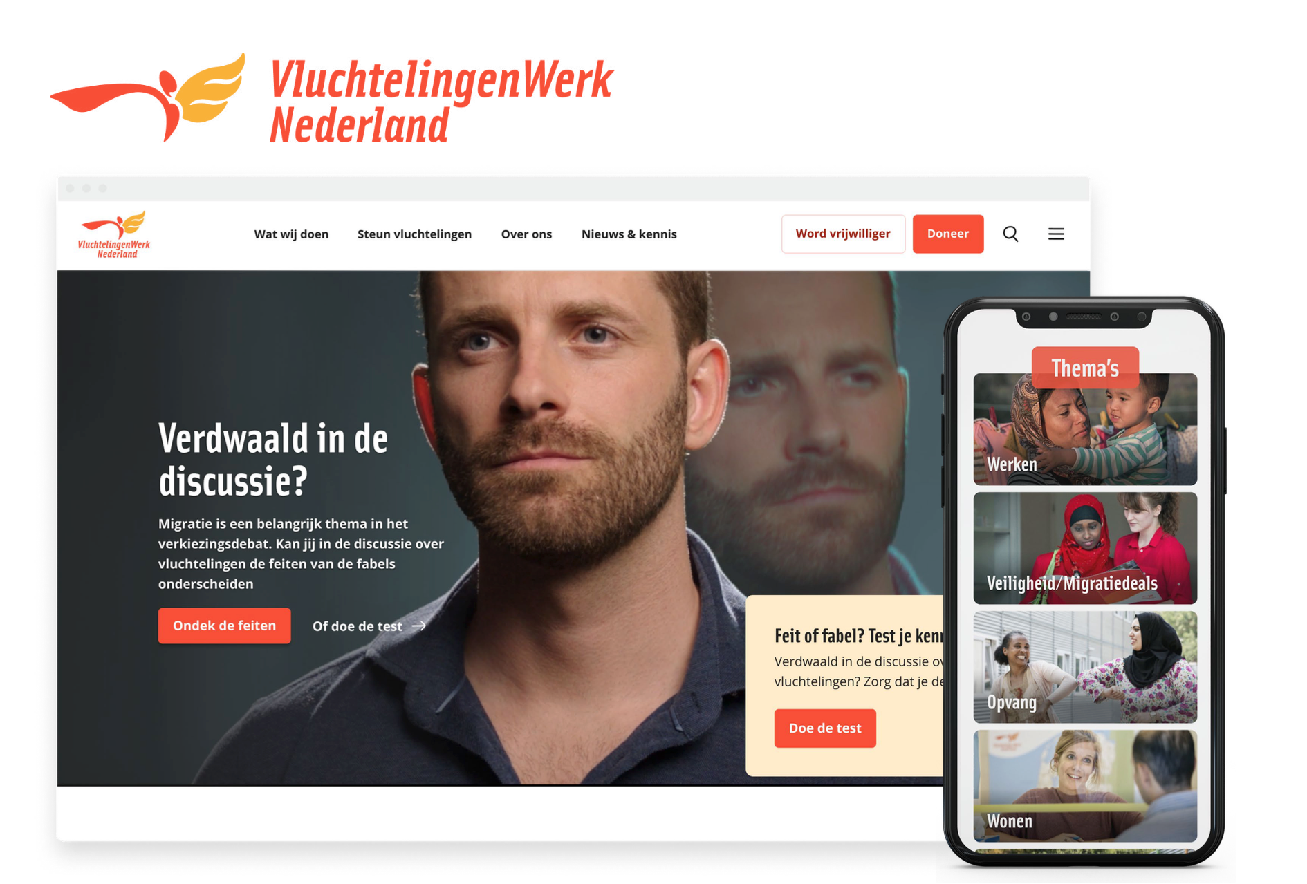
VluchtelingenWerk Nederland approached Unc Inc to redesign the homepage, campaign page, and theme pages. The current pages required reducing the prominent use of red to avoid associations with political parties. Additionally, there was a need for better coherence between images, text, and the donation button on the homepage. As the design lead, my challenge was to implement these changes within a tight deadline and optimize the design according to the preferences of Refugees Work NL.
The web pages have been redesigned to achieve improved harmony between images, text, and CTA buttons. On the homepage, a red block has been removed, directing attention to the image and text. Text and CTAs are placed directly on the image with reduced spacing for enhanced cohesion. To ensure readability, a black gradient overlay has been added to the image.
The previous red design has been abandoned in favor of using the secondary logo color; pastel orange. This visual hierarchy is replicated across the rest of the pages, maintaining recognition and adherence to the brand's identity.
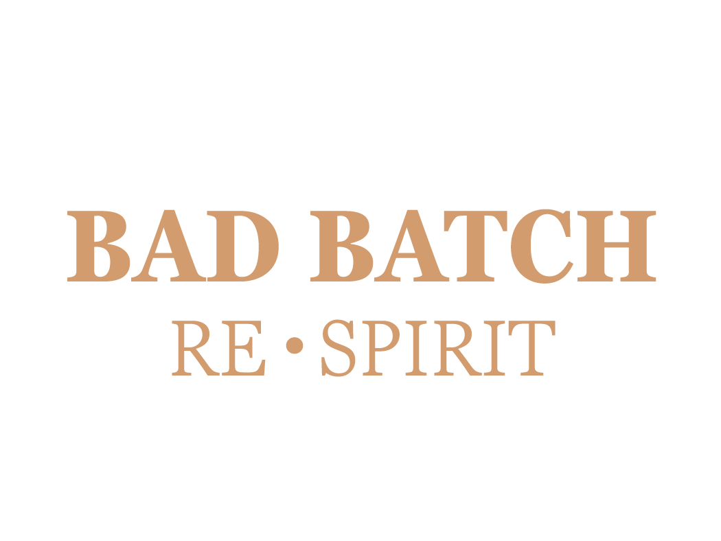
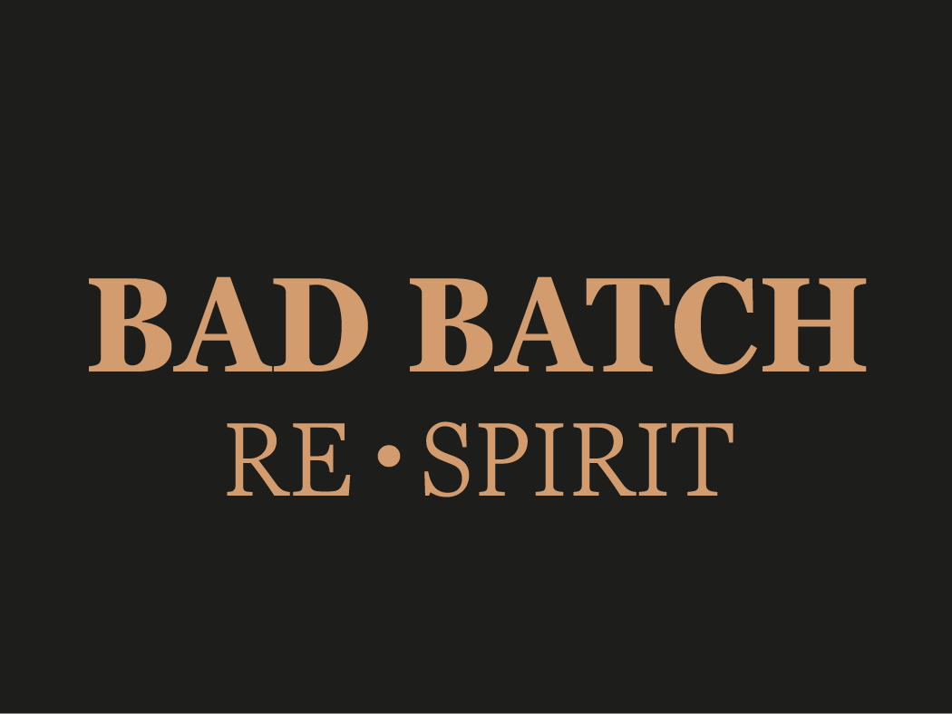
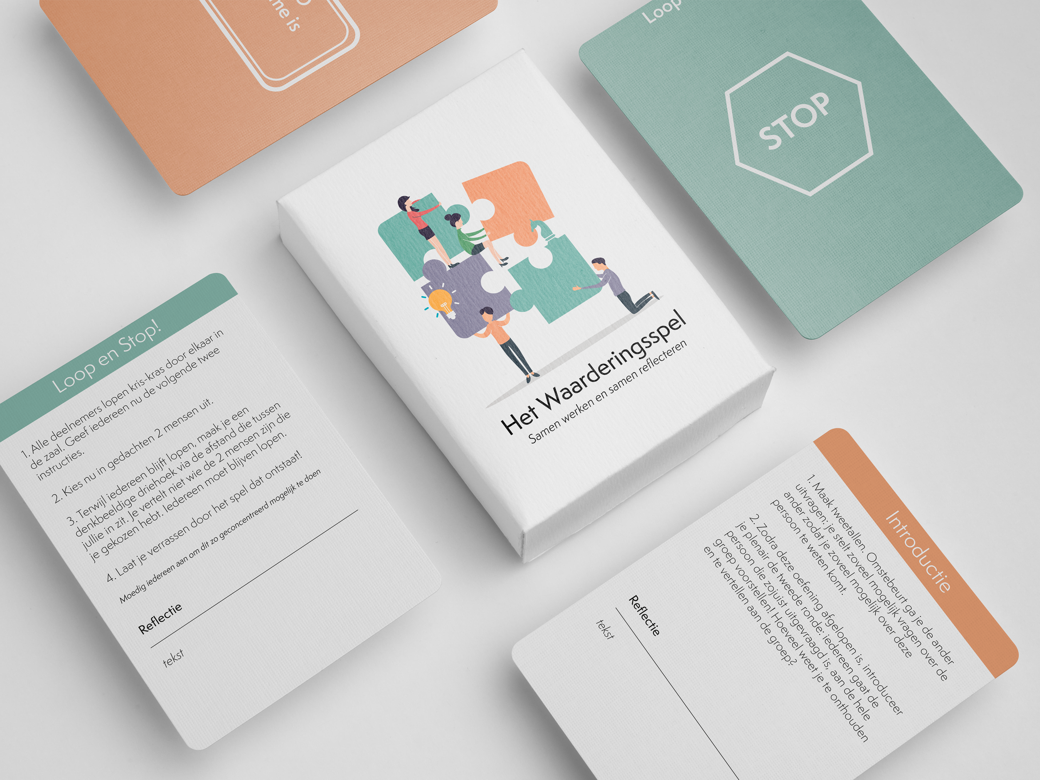
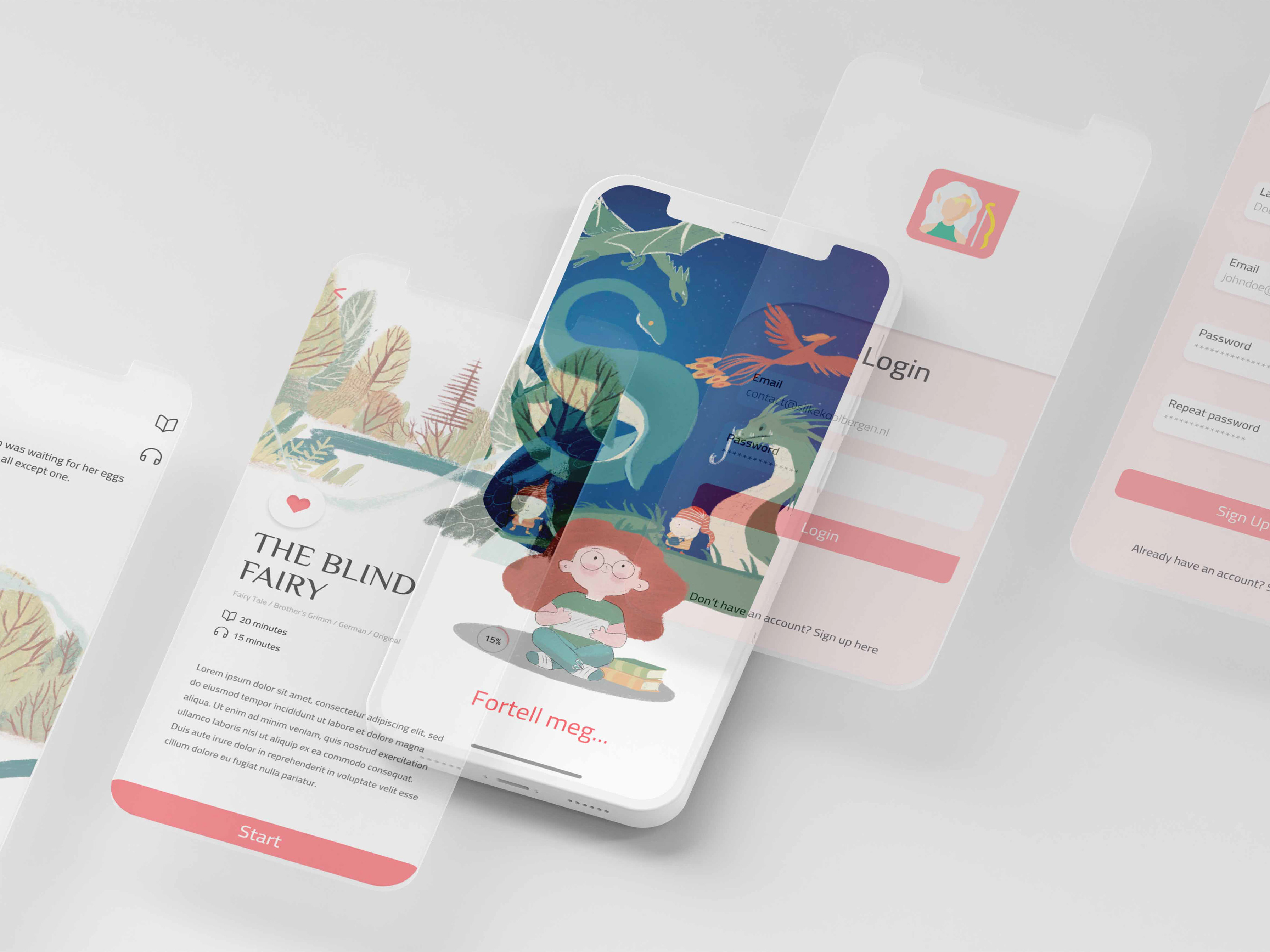
Due to privacy and other regulations I have decided to not showcase all cases worked on, since not all work has been publicly published. If you're curious about my design processes and reflections, feel free to send me a message. I'd be more than happy to provide further insights.
This internship at Unc Inc has led to significant development in skills as well as personal growth. Learning to work in Figma with Design systems, collaborating in an interdisciplinary team, and embracing the idea that it's okay to make mistakes have contributed to a highly successful completion of this internship. I want to express my heartfelt gratitude to everyone at Unc Inc for this wonderful experience.